

Flight
An all-in-one Lupus app, managing meds, offering support, rewards, & 24/7 medical guidance for a smoother journey. “It's You and Us Against Lupus.”
Role:
UX Researcher
UX Designer
Service:
Interaction Design
Service Design
18 Hours
Duration:
Situation
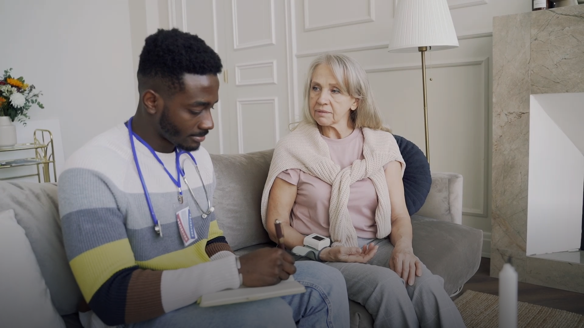
Individuals diagnosed with Lupus often face added stress due to the seriousness of their health condition. This heightened stress can result in occasional lapses in their daily medication regimen, which is a vital aspect of maintaining their health.
As attendees of HackUNT, the University of North Texas' annual hackathon, my team participated in a 24-hour development competition open to coders, designers, or anyone with a good idea. We participated in their design-based challenge for Amandus, which focuses on individuals diagnosed with Lupus.
We named our app Flight based on monarch butterflies.
Flight (noun)- a community of butterflies
This is reflective of the community feature that brings people together and has influenced our tagline, “You and Us Against Lupus”


Creating a less stressful method for medication management
We developed an app prototype named Flight, a gamified mobile app aimed at building community, motivating, and supporting those diagnosed with Lupus.
Our objectives were to:
Motivate and support those diagnosed with Lupus to adhere to their daily medication regimen
Prioritize the visual design above the technical intricacies required for app development
Focus on a compassionate, user-centric design that is aesthetically pleasing and memorable
Who is Flight for?
Assembling the Components of a Lupus Patient
Our brainstorming process was conducted through Figjam. The research was primarily based on data from the Lupus Foundation of America, which gave us an understanding of the challenges people diagnosed with lupus face.
Therefore, our personas were built upon our audience profile of 18-65-year-olds who have been diagnosed with Lupus and want to maintain a routine medication and symptom-tracking regimen and find support in the community.


Site Map & User Flow
We aimed to minimize clicks/taps on buttons to a maximum of three for them to be accessible.
We primarily relied on the scrolling features to ensure that users of the application could flow through the pages and input their medical tracking with ease and aimed to be considerate of possible joint and pain swelling a person diagnosed with Lupus may experience.


Breathing life into the concept
Low-Fidelity Wireframes
We built the wireframes using Figma and translated our first sketches into low-fidelity wireframes with a general outline for the location of the app's features and how it would overall flow for the patient using the app.

Executing the design
Using the important factors from our research, we wanted to ensure that the design was easy on the eyes and had buttons that could be navigated easily regardless of poor eyesight or swollen joints. We wanted a clean look with some color to balance it out and give off a calming effect.
UV Feature:
Lupus patients often battle flare-ups due to photosensitivity. A UV Index feature was included to reduce the possibility of flare-ups.
Motivational Reminders:
To remind and encourage the user to "keep it up!" With self-care and medication management, as well as some tips on how to handle some problems that are more likely to occur based on how they log their symptoms
Ascend Button:
The ascend button feature was a key part of this project. No repetitive typing will be needed. The only time you'll need to put in medication is when you first sign up for an app or get a new dosage. This will make tracking your dosages a click-and-go with no hassle and add up your points for our reward system.
Chat Feature:
For convenience, we've added a chat feature, AI for basic information, and a "Chat with a Professional" button for users who need to contact a professional directly.


Potential next steps
Conduct comprehensive research on health laws, corporate relations, communities, and healthcare providers while evaluating our initial concepts.
Thank you for reading!
Check out some of my other case studies
Want to work together? Feel free to contact me. | Email: athaliamgaston@gmail.com
Establishing Trust with IHHEs

Pawperty Fetch

Assisting travelers with last-minute flight cancellations
